8 Retro Bathroom Decor Ideas That Work With Your Existing Tile
Explore the ideas
That peach tile might be the best thing about your bathroom. It just needs something better beside it than another mismatched towel. Start with the room’s existing color, then choose one of these eight directions.
Each look below has its own visual example and a practical way to adapt it. Some change the whole color relationship, while others only touch a curtain or countertop. You can borrow one detail without copying an entire room.
These are original AI-generated styling concepts, rather than photographs of completed renovations. They illustrate color, scale and placement without promising a particular product’s appearance. Check your room’s measurements, surfaces and tenancy rules before making changes.
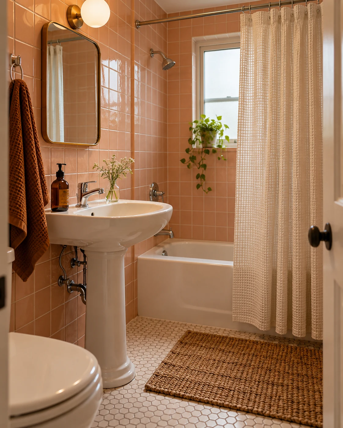
1. Let peach tile sit beside cream
Peach already brings plenty of warmth, so cream gives it somewhere calm to land. Here, the curtain and towel connect the white fixtures without trying to erase the walls. A small amber dispenser repeats the warmth in a darker shade.
Borrow the color relationship before shopping for the exact objects. Put an existing cream towel beside the tile during daylight and your usual evening lighting. Some creams look yellow beside pink tile, while others appear almost gray.
Keep the darker accent small if the bathroom is narrow. An amber bottle or brown towel can provide enough contrast around a white basin. Several dark accessories may make the counter feel crowded before you’ve added anything useful.
The curtain’s texture supplies interest without adding another pattern. Waffle cotton, a modest stripe or a loosely woven appearance can serve that role. Check whether your chosen fabric needs a separate liner for ordinary shower use.
For a first change, try the curtain and one towel. Live with those pieces before deciding the room needs a new mirror or lighting. Keeping functional fixtures lets the original tile remain the main character.
2. Give mint tile a deeper green companion
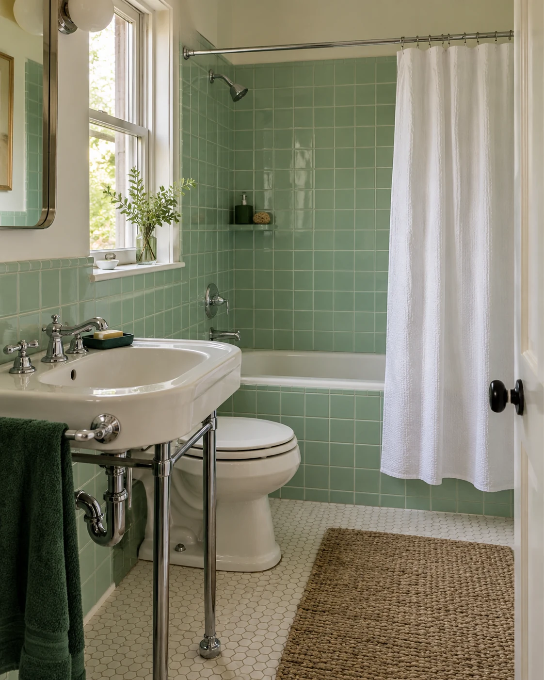
Mint looks more deliberate when another green appears nearby. A forest green towel creates that connection without requiring perfectly matching shades. White fabric around the bath keeps the overall room from becoming too green.
Notice how the darker color stays near the sink. That concentrated patch gives the room a focal point without outlining every fixture. You could create a similar effect with a dark green bath mat instead.
Choose the towel or mat according to the room’s actual drying space. A decorative textile becomes annoying when it never dries between uses. Make sure it can hang freely without dragging against the floor or radiator.
Existing chrome works comfortably within this arrangement. You don’t need to replace it because a basket or stool introduces warmer material. Repeating one finish everywhere can turn a small styling change into an unnecessary project.
If forest green feels too strong, try a quieter charcoal accent. The mint will still sit beside a darker anchor. Keep the shower curtain plain while deciding which version feels better in your room.
3. Warm blue tile with one rust accent
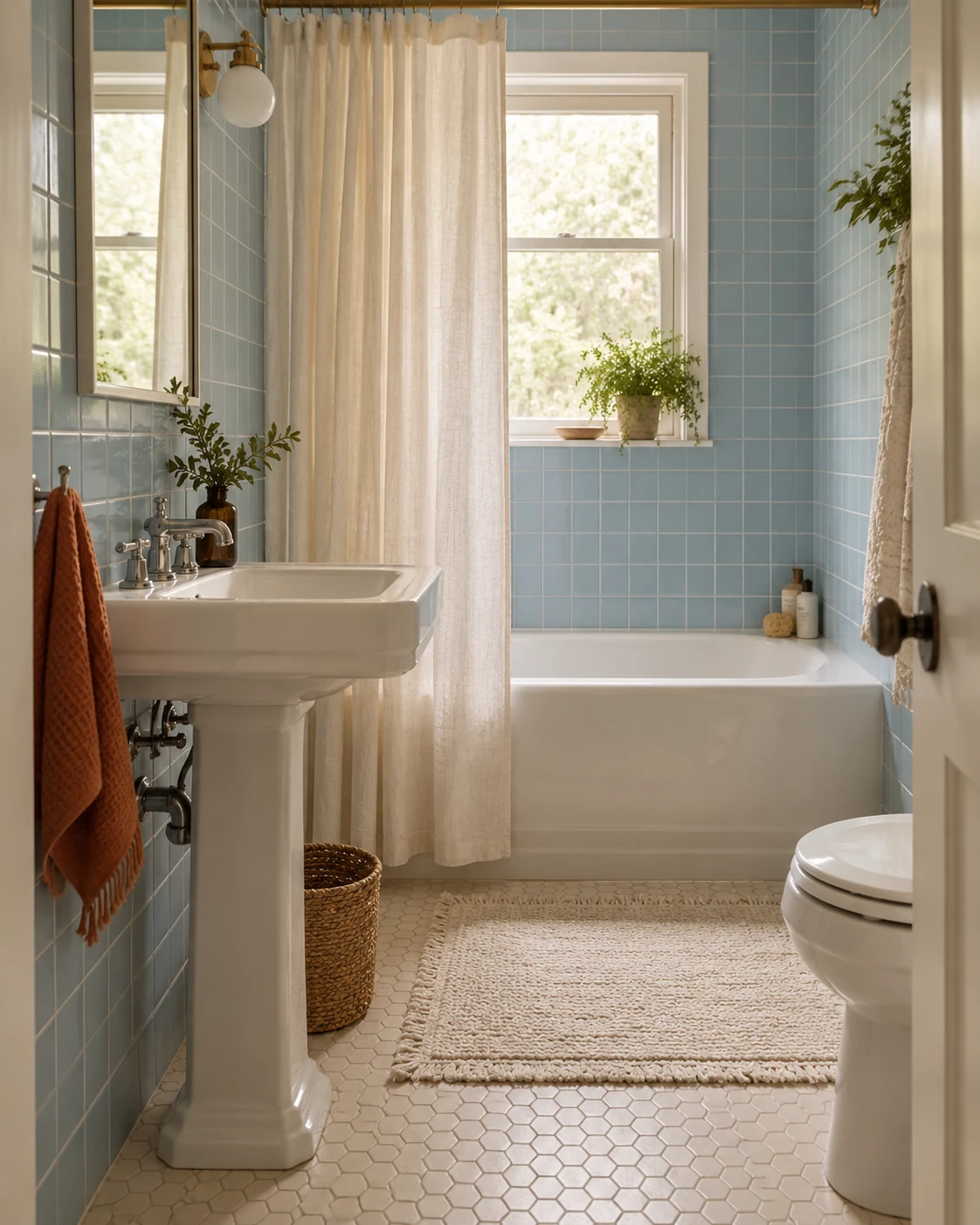
Blue tile doesn’t need a nautical theme to look finished. Warm white textiles and one rust towel create a different, softer relationship. The white basin and bath already provide useful repetition around the room.
Rust works here because it occupies a small area. Covering every surface in orange accessories would change the balance completely. Begin with something you already need, such as a hand towel beside the basin.
Look at the floor before introducing that warmer color. Older patterned flooring sometimes contains brown, beige or terracotta details worth repeating. Using an existing floor color can make the new towel feel less like an isolated purchase.
If the contrast feels too busy, remove the rust accent first. A blue and warm white bathroom can still feel layered through textile texture. A woven curtain and ribbed towel provide variation without another strong color.
Keep decorative objects away from the basin’s busiest edge. The room should still work when someone washes their face or reaches for a toothbrush. A finished-looking bathroom doesn’t need a display on every ledge.
4. Make a checked curtain the main pattern
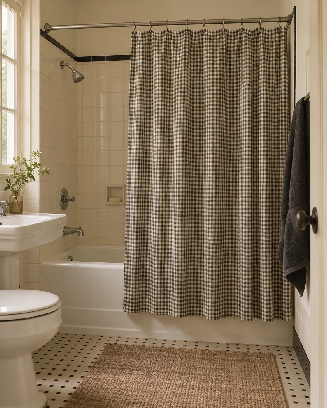
Small checks give plain tile a little movement. The curtain becomes the obvious pattern, while the surrounding towels stay uncomplicated. That division works especially well when the floor already has its own repeating detail.
Compare the check’s scale with the tile joints before buying. Tiny checks can disappear from the doorway, while large ones create a stronger graphic block. Neither is automatically better, but they produce noticeably different rooms.
Measure the curtain’s hanging width and finished drop. Include the existing rod and rings rather than measuring only the bath itself. The fabric should close comfortably without pooling on the floor or pulling awkwardly at the ends.
Choose a liner according to the actual curtain and shower arrangement. A decorative cotton layer isn’t automatically designed to contain shower water. Follow the product instructions instead of assuming a photograph shows every functional layer.
You can repeat one curtain color in a single towel. Leave the other textiles plain until you’ve seen the combination together. A second busy print usually adds more visual work than this compact look needs.
5. Add one scalloped detail
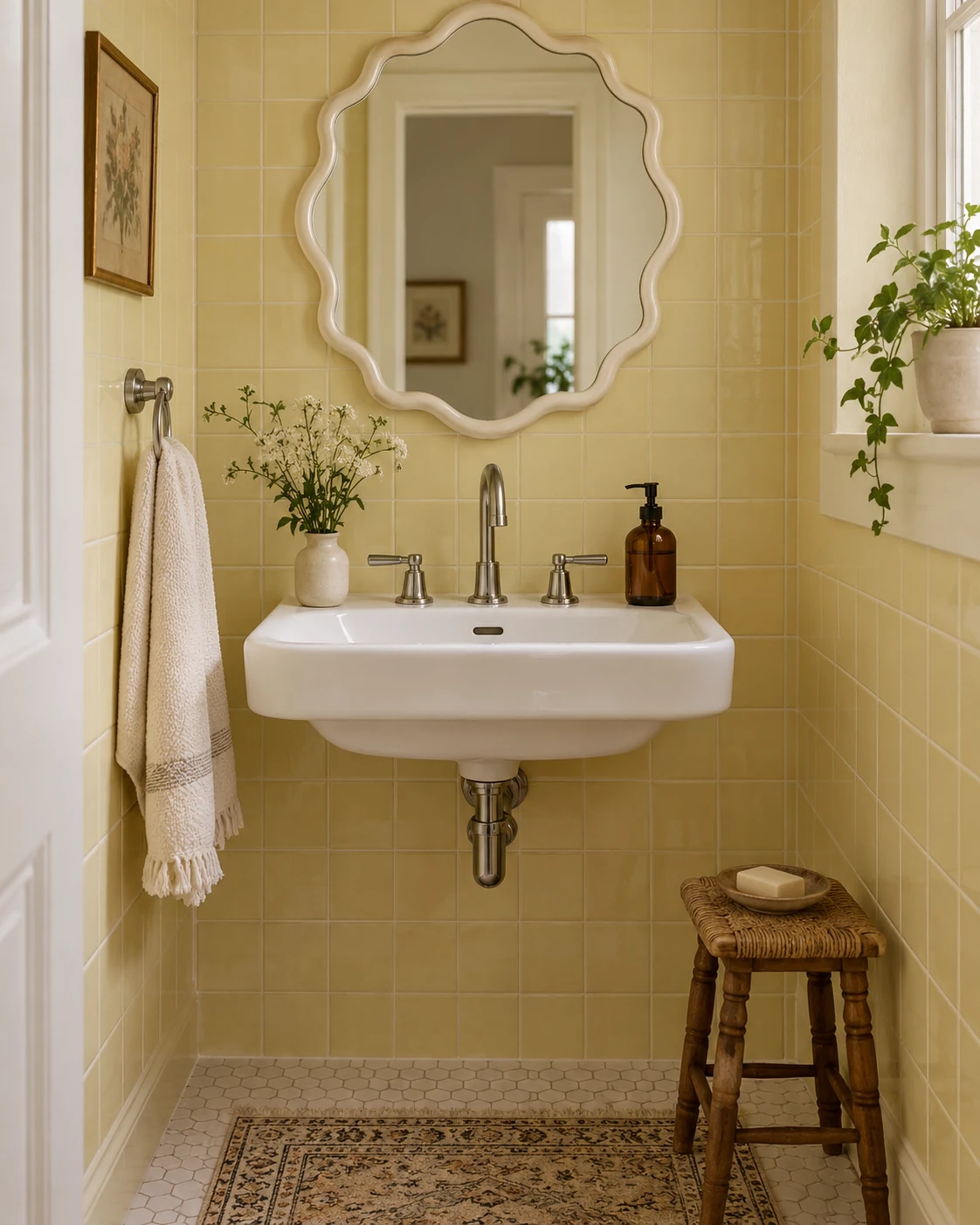
A scalloped edge can make a quiet bathroom feel playful without filling it with novelty objects. Here, the mirror supplies the detail while the tile and textiles remain simple. The curved outline changes the mood more than several small ornaments would.
Treat the mirror as a possible future change rather than a compulsory purchase. Your existing mirror may already have a rounded or decorative outline. Bringing that detail forward with quieter surroundings can create a similar effect.
For renters, a scalloped towel edge offers a smaller commitment. Choose a washable textile you would enjoy using without the decorative photograph. Avoid adding matching scallops to every object unless you actually want a much busier room.
Any mirror replacement needs suitable mounting and permission where required. Don’t choose adhesive hardware from appearance alone or assume all painted walls behave similarly. The mirror’s weight and the approved surface matter more than its attractive outline.
Keep the counter beneath it restrained. One useful dispenser and a hand towel let the curved detail register clearly. A cluster of bottles can hide the very feature you introduced.
6. Give a tiny counter one useful object
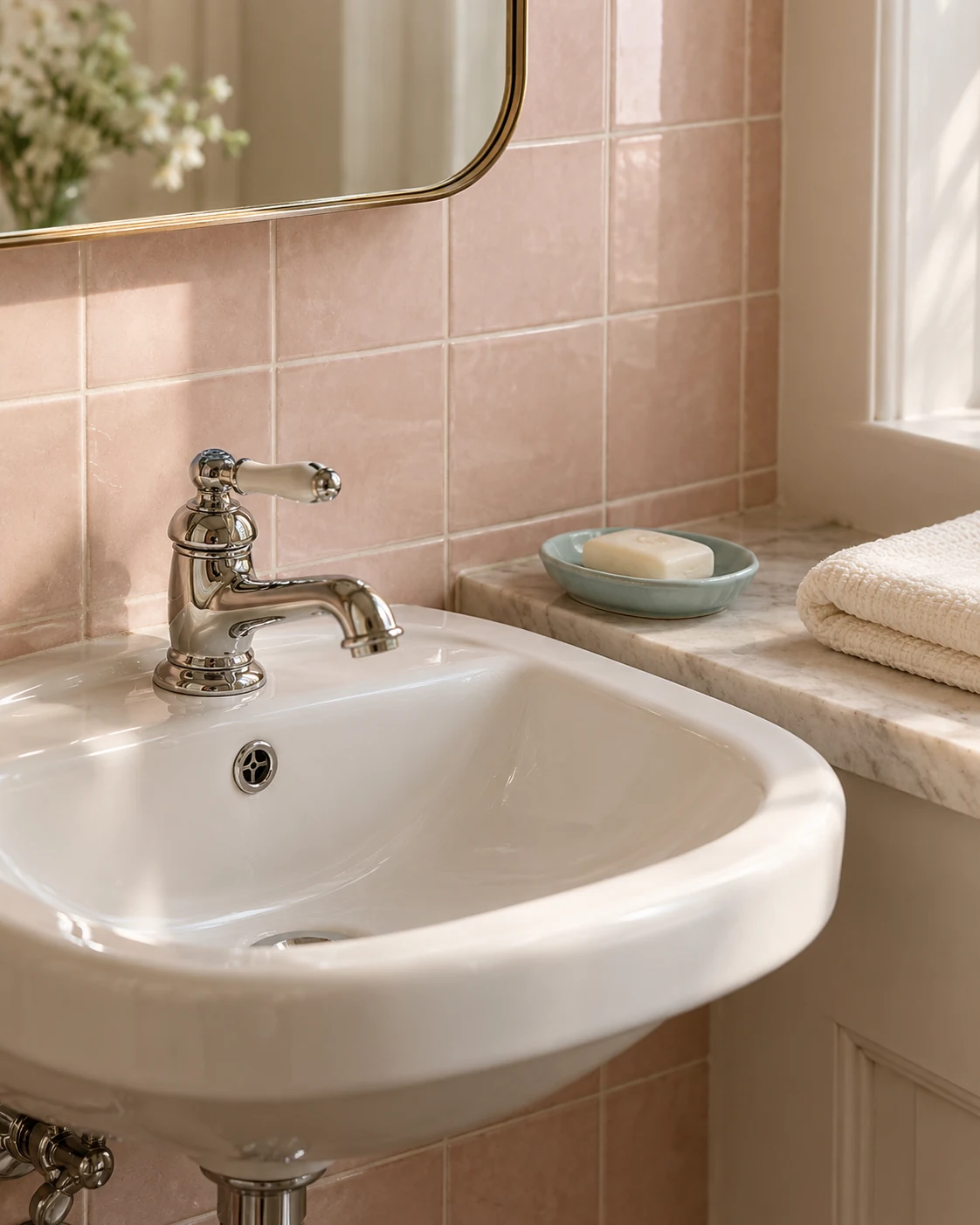
A soap dish can be enough decoration when the counter barely exists. The pale blue ceramic adds a small color change beside the pink tile. Clear space around it makes the basin feel easier to use.
Choose between a dish and dispenser according to your actual soap routine. Buying both for symmetry takes away space without solving another problem. Measure the usable ledge rather than the full outer width of the basin.
Check where water collects after ordinary use. A dish that looks tidy in a photograph may sit badly on a sloping edge. Put it somewhere stable and follow its care instructions rather than letting residue build underneath.
The hand towel needs its own practical position. Keep it away from the wettest splash area while making it easy to reach. If the ledge is too narrow, use an existing towel rail instead.
Before purchasing anything, clear the surface completely. Return only the items you reach for daily, then assess the remaining space. Sometimes the useful improvement is removing duplicates rather than introducing a new accessory.
7. Bring in a little warm wood
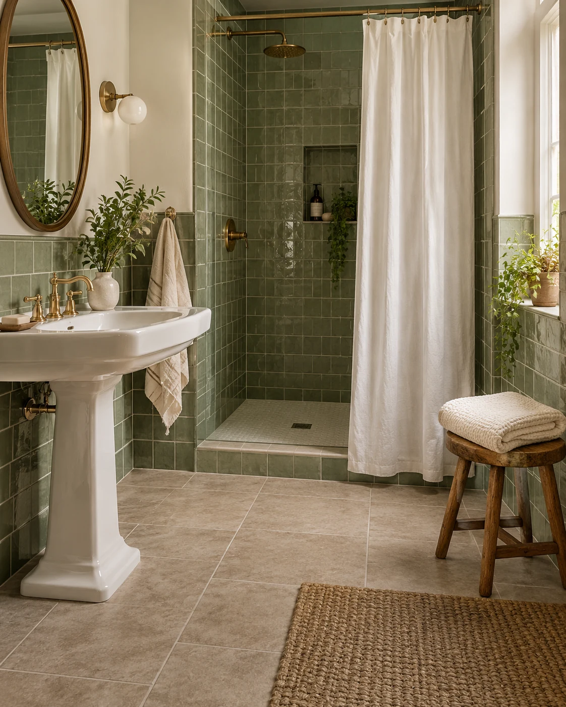
Wood adds a different surface beside glossy tile and chrome. A small stool can hold a dry towel without requiring another installed shelf. The contrast feels especially comfortable alongside sage or mint walls.
The stool needs a real place outside the wet area. Don’t squeeze it between the basin and door simply because that corner looks empty. Stand, turn and open the door before deciding it belongs there.
Choose a piece intended for the room’s conditions and follow its care guidance. Ordinary decorative wood isn’t automatically suitable for repeated moisture or standing water. A photograph can’t establish whether a particular finish will handle your bathroom.
Skip the stool when the floor needs to stay clear. An existing wooden mirror frame or small approved accessory can supply the same material contrast. You don’t need another piece of furniture to make the palette work.
Keep the towel arrangement believable for everyday use. One folded towel is enough to suggest the idea without building a hotel display. Give used textiles somewhere to dry instead of returning them damp to the stool.
8. Repeat a stripe in the towels
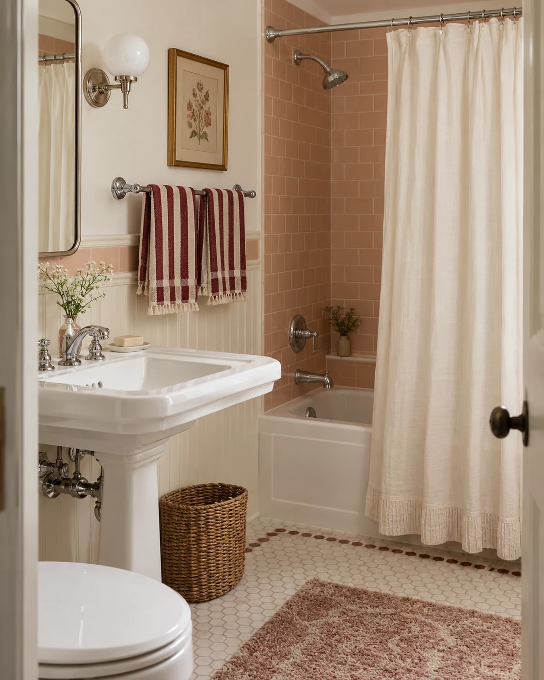
Striped towels can introduce the retro detail while everything larger stays plain. Burgundy and cream make a warmer pairing beside blush tile than a stark black stripe. The repeated lines provide enough pattern for a small wall.
Compare the stripe with any existing border tile. Parallel lines can look pleasantly related, but similar scales may also feel crowded. Hold a towel near the wall before committing to a complete set.
Two matching hand towels create repetition without needing several decorative layers. Keep their hanging arrangement loose enough for ordinary drying. A rail packed with folded display towels becomes less useful when someone actually needs one.
You can try the idea with one striped washcloth first. That smaller area lets you judge the color relationship without replacing your entire linen supply. Keep the shower curtain quiet while the stripe establishes its place.
Start with whichever look solves your room’s clearest problem. A busy room may need plainer textiles, while a flat one may need one darker accent. The useful change should make the bathroom more enjoyable to use as well as photograph.